The Complete Guide to Building High-Converting Landing Pages in 2025: 7-Step Framework + 7 Real-World Examples


Guide to Building High-Converting Landing Pages in 2025
Table of Contents
Serious about growing your business? Let’s plan exactly how to get you more leads, sales, and results—faster.
If you’re reading this, chances are your landing pages aren’t doing their job.
You’re getting clicks. You’ve got traffic. But the leads? They’re barely trickling in—and definitely not converting like they should.
And deep down, you know something’s off.
Every unconverted visitor is lost money. Every vague headline, cluttered layout, or slow mobile load is costing you sales.
Yet most businesses don’t fix the page. They just pour more money into ads—like a leaky bucket they keep trying to fill.
But here’s the thing: with ad costs rising across the board:
- Google Ads CPC is up over 10% year-on-year
- Meta (Facebook & Instagram) CPM rose by 18–22% in 2024
- TikTok CPM increased by 12–14%
- LinkedIn Ads have one of the highest CPMs at $33–$35, and they continue to climb
- Even YouTube Ads have seen 6–9% cost increases, especially in competitive verticals
Your real advantage doesn’t lie in a bigger ad budget. It lies in making every visitor count.
Digital Marketing, SEO & PPC
- SEO to boost rankings and capture high-intent, AI-driven traffic
- Performance Marketing to run ROI-focused campaigns that convert
- Content Marketing to drive clicks, earn links, and build authority
The smartest brands don’t chase more traffic. They squeeze more value out of the traffic they already have.
And that’s exactly what this guide will help you do.
We’ve taken proven strategies from experts like Neil Patel and Alex Hormozi and turned them into a clear, actionable system for high-converting landing pages.
With our 13+ years of experience scaling 1000+ businesses to multi-million dollar revenues, we know what works—and now, you’ll learn exactly how we do it.
Here’s what you’ll find inside:
- What “High-Converting” Actually Means
- The 3 Fundamental Rules Behind Every High-Converting Page
- Alex Hormozi’s Value Equation—Applied to Landing Pages
- The 7-Step Framework for Building High-Converting Landing Pages
- The 15 Essential Elements That Every Converting Page Must Include
- 7 Real-World Examples Deconstructed (SaaS, eCommerce, Real Estate, Travel)
- Best Tools for Building, Testing, and Scaling Landing Pages
- Common Mistakes That Kill Conversions, And How to Avoid Them
- The 15 Essential Elements That Every Converting Page Must Include
- The Future of Landing Pages: What to Prepare for in 2025+
- Implementation Help
Every strategy is broken down clearly, with examples and step-by-step actions.
By the end of this guide, you won’t just understand what makes a landing page convert—you’ll know exactly how to build one that becomes your best-performing sales asset.
Let’s get started.
What Is a High-Converting Landing Page?
A high-converting landing page is a standalone web page designed for one clear goal: getting the visitor to take action. That action might be signing up for a free trial, requesting a demo, downloading a lead magnet, or making a purchase.
Unlike a typical website landing page that may serve multiple purposes, a true high-converting page is laser-focused. It removes distractions and speaks directly to the visitor’s intent.
The best landing pages combine:
- A benefit-first headline and subhead
- A single, clear call-to-action (CTA)
- Engaging visuals or a short video that reinforces the offer
- Social proof (testimonials, client logos, trust badges)
- Mobile-friendly and fast-loading design
Whether you’re building a WordPress landing page, a Wix landing page, or using a tool like HubSpot or Unbounce, these principles apply.
Core Principles Behind Truly High-Converting Landing Pages (2025 Benchmarks)
Most landing pages typically convert at around 5.9%, based on HubSpot’s benchmark of 5.89%.
Most landing pages typically convert at around 6–7% — one in every 15 visitors—based on Unbounce’s Q4 2024 median of 6.6%.
However, the top 10% of high-performing pages often exceed 11%, with elite examples reaching 20–30%.
For example, one of our recent builds for AstroLondon, a premium artificial grass supplier, achieved over 20% conversion rate, proving that with the right system, it’s absolutely possible.
If you’re in e‑commerce, expect an average of around 2.5–3%, while SaaS pages hover between 3–5%. In financial services and real estate, it’s 2-3%, according to SeedProd.
Why the gap?
It all comes down to structure, clarity, and psychological triggers. Landing pages that hit 20%+ aren’t just lucky, they’re intentionally designed and continually optimised.
Key KPIs to Track
To reach top-tier performance, consistently monitor these:
- Conversion Rate – the ultimate measure.
- Bounce Rate – how many visitors leave immediately.
- Scroll Depth – how far they engage.
- Time on Page – a proxy for interest.
- Form Abandonment – is your form too long?
Focusing on these metrics reveals bottlenecks and shines a spotlight on where to experiment for improvement.
Marketing Research & Strategy
We help you understand your market and build smart strategies to attract more customers and grow faster.
- Detailed research into your competitors, customers, and market
- Custom marketing and growth plans that drive real results
- Clear action steps to increase traffic, leads, and sales

ADWORDS ROI

Cut Ad spend
The 3 Fundamental Rules for Building a Lead-Generating Landing Page
1. Never Send Ad Traffic to Your Homepage
Your homepage is like a lobby. Your landing page should be a private sales room.
Homepages are filled with menus, blogs, and distractions. Sending Google Ads or Meta traffic there leads to low conversion.
Paid traffic must go to a dedicated, focused lead generation landing page; otherwise, you’ll be just wasting your ad spend.
Example: A client saw conversions rise from 1.9% to 12.6% just by switching from the homepage to a campaign-specific landing page.
2. Clarity and Relevance Make or Break Your Page
Visitors judge within 3 seconds whether a page is relevant. If your headline doesn’t match the ad they clicked or the intent behind the search, they bounce.
Ask yourself:
- Is my message aligned with the traffic source?
- Is it crystal clear who this is for and what they get?
- Is my CTA obvious, immediate, and specific?
Message-to-market match isn’t just a theory. It’s the difference between a 2% and a 25% converting Google landing page.
3. Proven Structure Always Wins
High-converting landing pages are built, not guessed.
Follow this battle-tested structure:
- Headline with value promise
- 1 CTA above the fold
- Hero image or short explainer video
- Supporting benefits (bullets or visual blocks)
- Social proof
- Repeated CTA at the bottom
Forget design awards. The best landing pages are focused, skimmable, and free of clutter.
Alex Hormozi’s Value Equation Applied to Landing Pages
Alex Hormozi’s Value Equation is one of the clearest frameworks for understanding why some landing pages convert, and others flop.
It’s not just about what you’re offering. It’s about how valuable that offer feels to the visitor, and how easy you make it to say “yes.”
“The more value your page communicates and the more friction you remove… the higher your conversions go.”
Source: Acquisition.com
The 4 Core Levers of Value (Before We Break Them Down)
Before we go deeper into how to apply this to your landing page, here’s the quick breakdown of Hormozi’s Value Equation:
- 1. Dream Outcome – What big result does your audience want most?
- 2. Perceived Likelihood of Achievement – Do they believe you can actually help them get there?
- 3. Time Delay – How long will it take to see the result?
- 4. Effort & Sacrifice – How much work, pain, or change is involved?
- The first two increase perceived value.
- The last two increase perceived cost (not price, but friction).
The secret?
Your landing page should maximise the first two—and crush the last two. That’s how you make any offer irresistible.
Dream Outcome: Show What They Really Want
Visitors don’t care about your product. They care about the result it gives them. Your landing page headline and hero copy must clearly communicate the outcome they desire.
- Instead of: "We offer AI-based real estate valuations."
- Use: "Know your home’s worth in 60 seconds."
Always frame your offer in terms of results, not features. This shift in language helps your audience instantly understand the value of taking action.
Perceived Likelihood of Success: Make It Believable
Even if your offer is amazing, users won’t convert unless they believe it will work for them. That’s where trust comes in. You can increase perceived likelihood through:
- Social proof: Real testimonials with faces, names, and locations
- Trust badges: Certifications, media mentions, client logos
- Visuals: Demo videos or product walkthroughs
Reducing the perceived delay makes the action feel more achievable.
Time Delay: Minimise the Wait
Your visitors want results fast. If your offer feels like it will take forever, they’ll bounce. The best high-converting landing pages clearly communicate speed.
Use lines like:
- "Get funded in under 24 hours."
- "Book your free consultation in minutes."
- "Receive your quote instantly."
For example, a Wix landing page that featured user testimonials and partner logos saw a 38% increase in sign-ups. Why? Because belief drives behaviour.
Effort & Sacrifice: Reduce the Friction
People avoid effort. If your landing page makes it look hard to take the next step, conversion rates will drop. Your job is to make that next step feel effortless.
Strategies to reduce friction:
- Keep forms short: Ask only for what you need (start with just an email)
- Pre-fill fields when possible
- Remove all unnecessary steps or choices
In short, if you want a high-converting landing page, apply the Value Equation across every element: headline, copy, visuals, CTAs, and form design.
Help users see big rewards, fast timelines, believable outcomes, and minimal effort.
That’s the winning formula.
Digital Marketing, SEO & PPC
- SEO to boost rankings and capture high-intent, AI-driven traffic
- Performance Marketing to run ROI-focused campaigns that convert
- Content Marketing to drive clicks, earn links, and build authority
The Psychology Behind High-Converting Pages
Understanding the psychology of your visitors is one of the fastest ways to increase landing page conversion rates.
Every click, scroll, and hesitation is shaped by cognitive biases, and mental shortcuts that influence decision-making.
Let’s explore the most powerful psychological triggers that top-performing landing pages use to consistently convert.
Cognitive Biases That Drive Conversions
1. Social Proof Bias
Humans take cues from others when making decisions. That’s why social proof—testimonials, reviews, user counts—works so effectively.
What works:
- Testimonials with real names and photos
- “As seen on” media mentions
- User stats (e.g. “Used by 10,000+ agents in the UK”)
How to avoid faking it:
- Avoid stock photos and vague names
- Use verified reviews, real-time activity widgets, or UGC from social platforms
Make it even more better:
- Sit with the client and capture Q&A-style testimonials to make dialogue sound real and natural
- If you can’t meet in person, run the session over Zoom and record the interaction
- If the client is local, invite them to your office and film there—it adds credibility and comfort, enhancing authenticity
Real example: Curology’s landing page boosted sign-ups by 43% after showcasing before/after photos and verified Instagram reviews.
2. Scarcity and Urgency
People act faster when they fear missing out.
Psychological triggers:
- Countdown timers (“Offer ends in 2h 16m”)
- Quantity limits (“Only 4 spots left”)
Ethical tips:
- Use urgency that reflects reality (like webinar seat limits or real-time inventory)
Why it works: Urgency taps into the scarcity bias—our tendency to overvalue limited resources.
3. Authority and Trust
Visitors won’t take action unless they believe you’re credible. Build authority early in the journey.
How to build trust fast:
- Feature expert endorsements or certifications
- Mention client results or media features
- Use SSL badges, trust badges, and guarantees
- Mention client results or media features
Positioning tip: The earlier you present trust signals (especially above the fold), the more likely users are to scroll and explore further.
The "So That" Principle (Hormozi Method)
Framework:
“We do X… so that you can Y.”
Example: “We provide tailored investment properties… so that you can generate consistent passive income.”
Why it works: It shifts focus from features to benefits, and connects your offer to an outcome that emotionally resonates.
Use it in headlines, CTA subheadings, or benefit bullets.
High-converting colours:
Red
Urgency (works well for limited offers)
Green
Go/action (especially for financial offers)
Orange
Warmth + visibility (commonly used in eCommerce)
Contrast is key: Ensure your CTA button colour stands out from the background. Low contrast = low clicks.
Cultural note: Colours carry different meanings across regions. For UK-based audiences, avoid overly aggressive schemes unless contextually relevant.
The Attention Ratio Concept
A key difference between best landing pages and low performers? Focus.
Rule of thumb:
One ad = One page = One action.
Why it matters: Every extra link or option increases cognitive load and decreases conversions.
What to do:
- Remove navigation menus
- Avoid multiple CTAs with competing goals
- Structure layout to guide attention linearly
Now that we’ve uncovered the key psychological levers, let’s translate them into page structure. The next section reveals the exact layout top-performing landing pages use to turn browsers into buyers.
Marketing Research & Strategy
We help you understand your market and build smart strategies to attract more customers and grow faster.
- Detailed research into your competitors, customers, and market
- Custom marketing and growth plans that drive real results
- Clear action steps to increase traffic, leads, and sales
ADWORDS ROI
Cut Ad spend
The 7-Step Framework for Building High-Converting Landing Pages
Step 1: Deep Audience Research & Persona Development
(The Step Most Businesses Skip — and Why It Costs Them)
Every high-converting landing page starts with deep audience understanding.
You can’t write powerful copy or design a persuasive layout unless you know exactly who you’re speaking to, what keeps them up at night, and what motivates them to act.
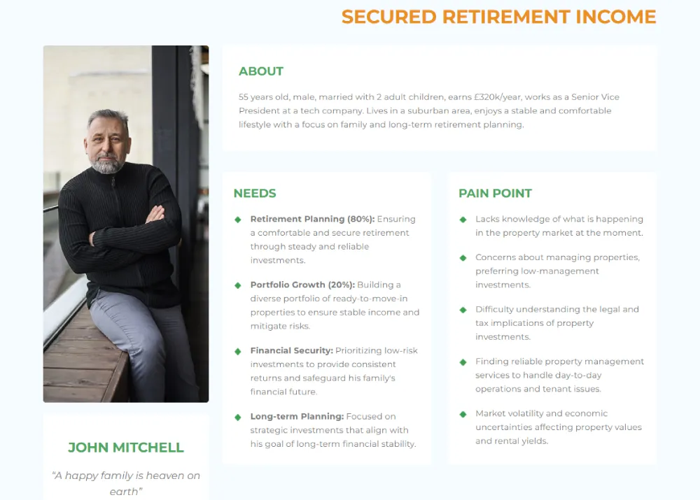
Most businesses assume they know their audience—but this assumption is the root cause of poor conversions and wasted ad spend. We’ve seen this firsthand.
One of our real estate clients believed their investors weren’t doing any active research. They said:
“People just have money lying in their accounts. They rely on us to suggest the right investment—they’re not going online and comparing.”
But after speaking with 100+ of their investors, we discovered something very different:
- They were researching—but not in obvious ways.
- They felt overwhelmed, feared scams, and didn’t understand the market well enough to decide.
- They relied on agents because they lacked trust in online information, not because they preferred it.
That’s the danger of skipping real research: your message misses the mark, and conversions suffer.
So always start with research. Use tools like Ubersuggest or Google Keyword Planner to find keyword insights that reflect what your target audience is actually searching for.
You can also use AnswerThePublic to discover long-form informational and commercial queries that your audience types into search engines.
These natural-language questions are especially useful for identifying topics that align with AI Overviews, helping your page rank in more conversational search results.
Google Analytics can show how users behave once they land on your site—where they drop off, what pages they engage with, and what devices they use.
Competitor gap analysis helps you identify what others in your space are missing, giving you a chance to differentiate. For even richer insights, run structured user interviews.
Ask about their biggest pain points, what they’ve tried before, and what outcomes they want.
Based on this, build detailed buyer personas. Capture:
- Pain points and frustrations
- Motivations and desired outcomes
- Conversion blockers (e.g. pricing fears, lack of trust, decision fatigue)
- Stage of awareness (problem-aware, solution-aware, product-aware)
This foundational work powers everything that follows—from your headline and hero image to your CTA button text.
Want help doing this right?
Grab the Real Estate Brand Builder Kit, our complete system for building a real estate brand that doesn’t just look sharp but converts.
It walks you through everything from defining your buyer personas to aligning your brand voice, visuals, and messaging for maximum trust and ROI.
We’ve used it to help clients 2–3x their lead flow and dramatically lift conversions, without spending more on ads. Now it’s your turn.
Step 2: Define Your Most-Wanted Action (MWA)
Your landing page must have a single, clear goal. That’s your MWA—the one action you want visitors to take.
It could be to download a guide, start a free trial, book a call, or make a purchase. But not all MWAs are equal. Your choice should be based on:
- The complexity of your product or service
- How much trust you need to build before someone can act
- Where the visitor is in their decision-making timeline
For simpler products or highly motivated audiences, you can go straight for the sale. But if you’re selling high-ticket services or B2B solutions, consider a lower-friction offer like a free consult or downloadable resource.
Make sure your MWA is aligned with user intent. Don’t push a demo when they just want to learn. And don’t ask for a phone number if an email will do.
Step 3: Craft Your Core Message & Value Proposition
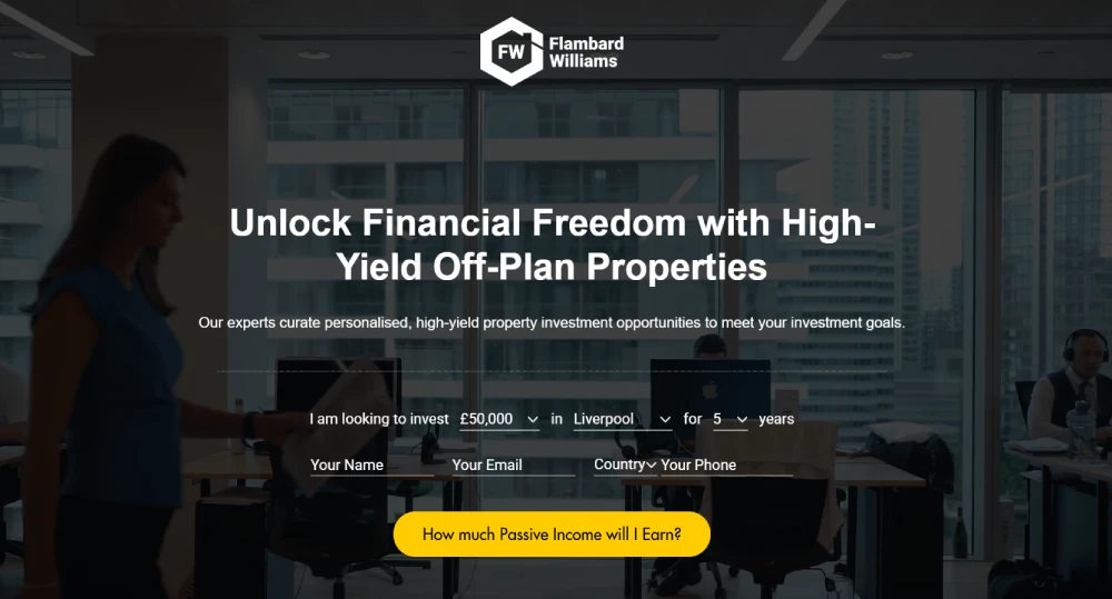
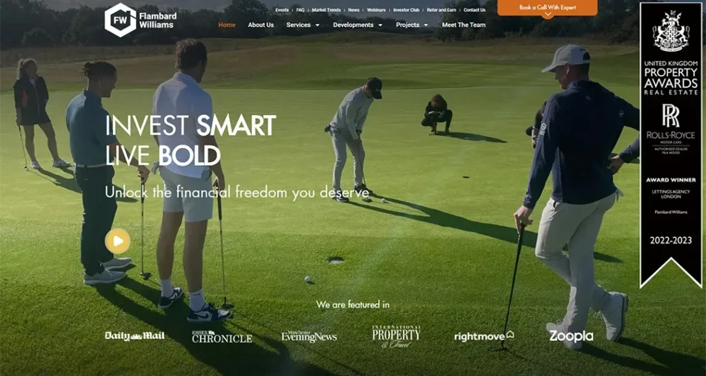
Source: flambardwilliams.co.uk
Once your MWA is clear, it’s time to shape the message that earns it.
Start by identifying the problem your visitor is trying to solve. Then position your solution as the bridge to their desired outcome. This is the heart of your value proposition. It’s not just what you offer—it’s why it matters.
To develop strong messaging:
- Match problem-solution fit clearly in your headline and subhead
- Articulate your unique value (what makes you different or better?)
- Tap into emotional drivers like fear of missing out, safety, ease, or transformation
Then test it. Use A/B testing to compare headlines, subheads, and CTA copy. Pay attention to clarity—often a simpler, clearer message will outperform a clever one.
Always validate against the message-to-market match. If you’re saying the right thing to the wrong audience, it won’t convert.
Step 4: Strategic Design & Layout Planning
Source: flambardwilliams.co.uk
Now that your message is clear, it’s time to bring it to life with layout and design. A great landing page guides the eye, minimises friction, and creates visual momentum.
Start above the fold. Your headline, subhead, CTA, and hero image should all appear without scrolling. This is your make-or-break real estate.
Use a strong visual hierarchy:
- Highlight the most important elements with size, colour, and contrast
- Group supporting content into digestible sections
- Use whitespace to avoid overwhelming the visitor
Your layout should follow an inverted pyramid structure. Begin with the strongest message, then offer more supporting information as users scroll. This progressive revelation keeps people engaged.
Don’t forget mobile-first design. Most users will visit on phones—so ensure buttons are thumb-friendly, text is readable, and load time is lightning fast.
Step 5: Content Creation & Copywriting
Source: flambardwilliams.co.uk
Words matter. Great design might get attention, but great copy drives action.
Use proven frameworks like AIDA (Attention, Interest, Desire, Action) or VIA (Value, Interest, Action) to structure your message.
Every line of copy should move the reader one step closer to clicking your CTA. Focus on benefits, not features. Tell them what they’ll get, how it helps, and why it’s better than alternatives.
Make your content skimmable:
- Use bolded headers and subheaders
- Break content into short paragraphs
- Use bullet points to highlight key benefits
Also, optimise for readability. Use simple language, active voice, and short sentences. Even complex products can be described in clear, human terms.
Step 6: Technical Implementation & Mobile Optimisation
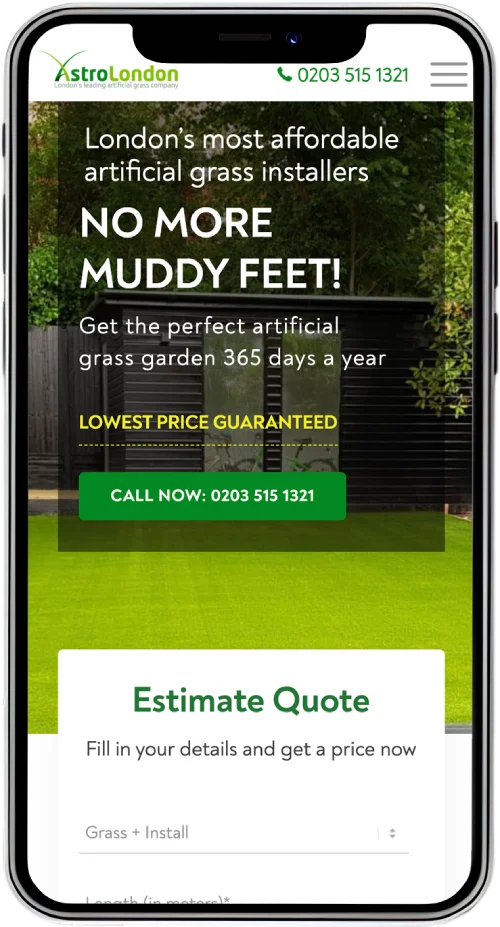
Source: astrolondon.co.uk
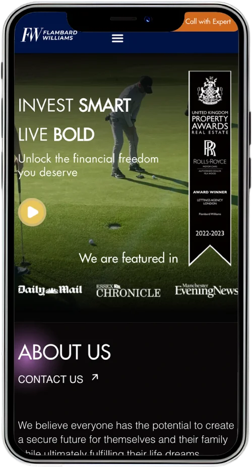
Source: flambardwilliams.co.uk
Once your copy and layout are ready, it’s time to bring your landing page to life with the right tools and integrations.
Choose the right platform. Whether it’s a Shopify landing page for e-commerce, a WordPress landing page for a service business, or HubSpot for B2B, your choice affects flexibility and speed.
Make sure your builder supports:
- Customisable forms and CTA buttons
- Analytics and tracking scripts
- CRM and email tool integrations
Mobile optimisation is non-negotiable. Right now, over 60% of global web traffic comes from mobile devices—recent data places it between 62–64% in 2025.
That means more than half of your visitors are on phones or tablets. In regions like India, mobile traffic can be as high as 80% .
Plus, Google now operates under mobile-first indexing, meaning it crawls and ranks based on your mobile site. And although mobile-friendliness is just one part of Google’s page experience algorithm—not a silver bullet—it’s still essential.
A slow or poorly-designed mobile page can hurt both your SEO visibility and conversion rates—and even damage ad Quality Score across devices.
So, test your page across multiple screen sizes. Ensure all buttons are tap-friendly and that layout elements don’t break. Optimise load speed by compressing images and reducing unnecessary scripts.
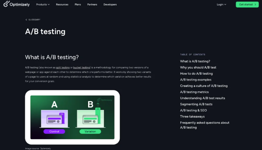
Step 7: Testing, Analysis & Iteration
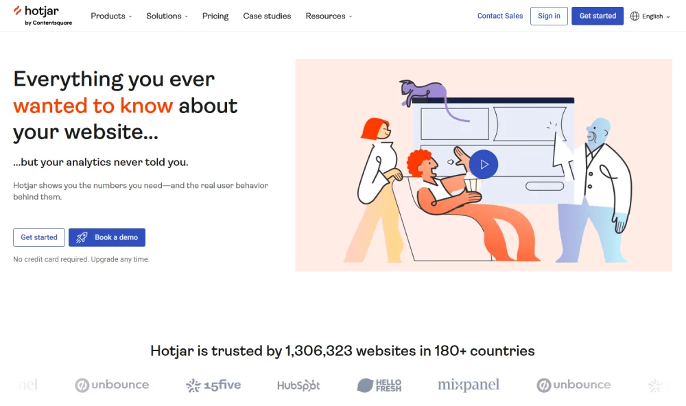
Source: www.hotjar.com
A landing page isn’t a one-and-done asset. The best-converting landing pages evolve through continuous testing and data-driven iteration.
Start by setting up tracking. Use tools like Google Analytics and Hotjar to track conversions, heatmaps, scroll depth, and bounce rates.
Test one change at a time:
- Headline variations
- CTA button text and colours
- Offer positioning or layout order
Look for statistical significance before acting on any result. Don’t guess—measure. Aim to run one meaningful test per week, and keep iterating based on what the data tells you.
Finally, build a feedback loop. Regularly review performance, map user behaviour, and prioritise changes that can bring compound conversion lifts over time.
By following this 7-step framework, you’re not just building another landing page. You’re designing a focused, high-converting machine tailored to your audience’s psychology and journey.
This is the foundation for generating qualified leads, increasing sales, and making every visitor count.
Digital Marketing, SEO & PPC
- SEO to boost rankings and capture high-intent, AI-driven traffic
- Performance Marketing to run ROI-focused campaigns that convert
- Content Marketing to drive clicks, earn links, and build authority
15 Essential Elements Every High-Converting Page Must Have
Once you’ve laid the strategic foundation with research, messaging, and layout, the next step is to ensure your landing page includes the right elements—each serving a distinct psychological and functional purpose.
Above-the-Fold Essentials (60% of Users Never Scroll)
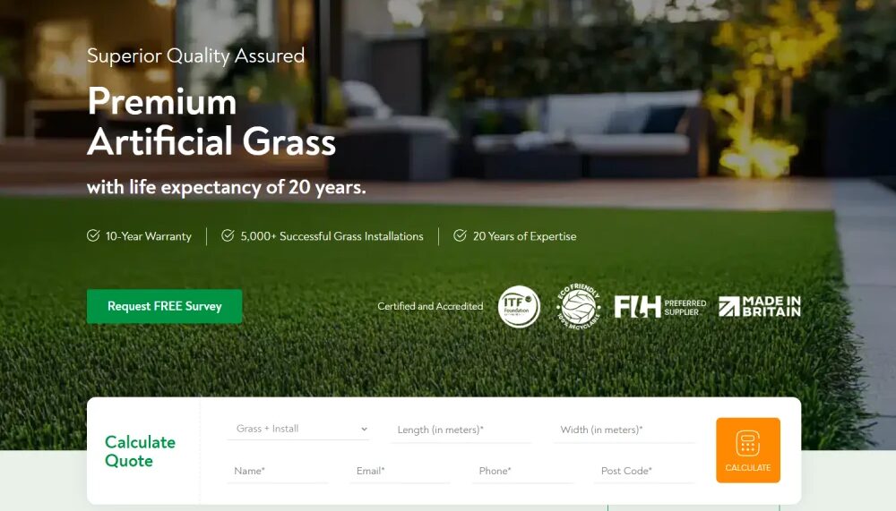
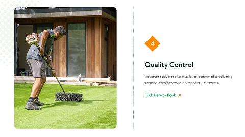
Source: superiorlawn.co.uk
1. Compelling Headline
Your headline is the most important element on the page. It must instantly grab attention and communicate a clear benefit. Use formulas like “Get [Result] Without [Pain]” or “How to [Achieve X] in [Timeframe]” to hook your audience emotionally and logically.
A/B testing can reveal what resonates. For example, switching from a product-focused headline to a benefit-driven one often increases conversions by 20–35%.
2. Supporting Subheadline
This expands on your headline by adding detail and amplifying the benefit. Keep it short—ideally one or two lines—and focus on clarifying what the user will gain.
3. Hero Image or Video
Visuals play a key role in reinforcing the message. A high-quality image or short video (30–60 seconds) that demonstrates your product or evokes the desired outcome can boost engagement significantly.
In many cases, UGC (user-generated content) outperforms polished studio visuals due to its authenticity.
4. Primary Call-to-Action (CTA)
Your CTA must be visible immediately and stand out visually. Button design matters: use contrast colours, readable font size, and action-oriented copy (e.g., “Get My Free Quote” instead of “Submit”).
Placement should be above the fold and repeated at strategic intervals throughout the page.
Trust & Credibility Elements
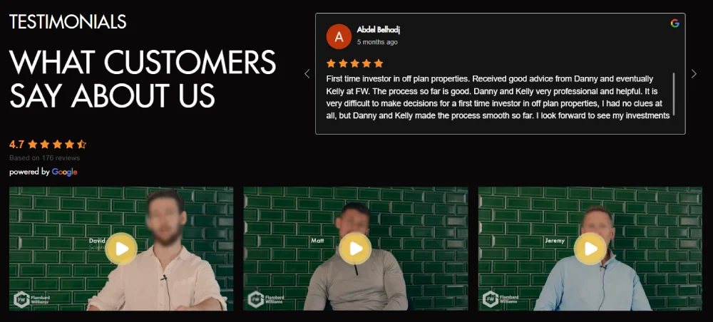
Source: flambardwilliams.co.uk
5. Social Proof Integration
Showcase testimonials, reviews, or user stats to build confidence. Use real names, photos, and job titles to make testimonials credible. Present reviews using sliders or quote blocks for easy consumption.
6. Trust Badges & Guarantees
Display badges like “Secure Checkout,” “100% Money-Back Guarantee,” or “Trusted by 10,000+ Customers.” These small icons significantly reduce purchase hesitation, especially for new visitors.
7. Authority Indicators
Mention media features (“As Seen On”), expert endorsements, or certifications to position your brand as credible. This is especially important for B2B, finance, or health-related offers.
Conversion Optimisation Elements
Source: superiorlawn.co.uk
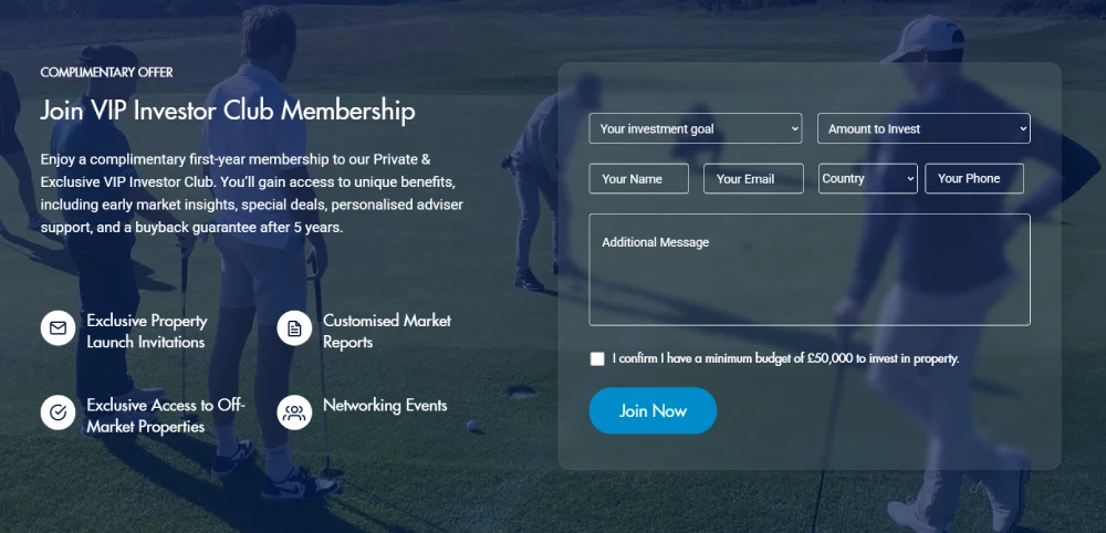
8. Lead Capture Form
Keep forms short—only ask for what’s necessary. Three fields or fewer typically yield the best results. Use progressive profiling if more data is needed later on the thank you page. The design should be clean, with labels and tooltips to guide users.
9. Value Proposition Clarity
This is often overlooked. Make sure the user can clearly understand what they’re getting, why it’s valuable, and how it’s different from other options. Include benefit-driven subheadings and supporting visuals or stats.
10. Friction Reduction Techniques
Simplify the process wherever possible. Remove unnecessary steps, use reassuring microscopy (“No credit card required”), and answer unspoken questions that may cause hesitation.
Supporting Elements
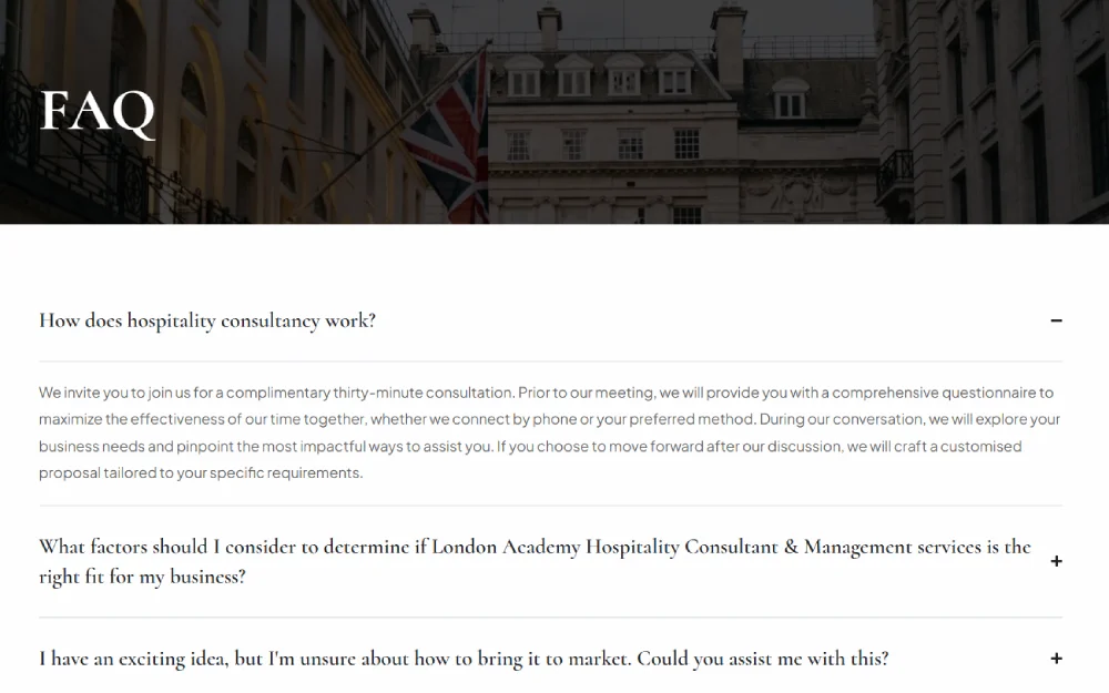
Source: londonaoh.com
11. FAQ Section
A well-written FAQ isn’t just informative—it’s a conversion tool. Use it to overcome objections, explain features, and reduce uncertainty. Structure it based on real customer concerns.
12. Contact Information
Make it easy for users to reach out. Include live chat, email, and a phone number if possible. Setting response time expectations builds trust and reduces anxiety.
13. Privacy Policy Access
Especially important in GDPR-compliant markets like the UK. Link to your privacy policy near the form or CTA. Use plain language to reassure users their data is safe.
14. Mobile Optimisation
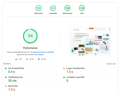
Over 70% of users will view your landing page on a mobile device. Ensure touch-friendly buttons, short form fields, fast load times, and simplified navigation. Use tools like Google PageSpeed Insights to audit performance.
15. Exit-Intent Elements
Capture abandoning visitors with popups that offer last-chance discounts, lead magnets, or reminders. This is your final opportunity to convert a visitor before they leave.
Each of these 15 elements plays a specific role in reducing friction, building trust, and motivating action.
When combined strategically, they create the kind of landing page that doesn’t just look good—it performs consistently above the industry average.
Marketing Research & Strategy
We help you understand your market and build smart strategies to attract more customers and grow faster.
- Detailed research into your competitors, customers, and market
- Custom marketing and growth plans that drive real results
- Clear action steps to increase traffic, leads, and sales
ADWORDS ROI
Cut Ad spend
Advanced Optimisation Strategies That Increase Conversion Rate
As your landing page begins to mature, so should your optimisation efforts. Once the foundations are in place—strong copy, clear CTA, clean design—it’s time to go beyond the basics.
The following strategies can increase your conversion rates significantly, often without changing the core offer. These are the tactics the best landing page designers use to edge past the competition.
1. The Above-the-Fold Focus Strategy
Smart marketers allocate 99% of their effort to the top 600 pixels of a page—and for good reason.
More than half of visitors never scroll. If the above-the-fold section doesn’t grip them, you’ve already lost the sale.
This space should include your core value proposition, a clear headline, a strong subheadline, and one visible CTA. Prioritise this section in both design and testing.
When running CRO experiments, test above-the-fold content first—it’s where you’ll often get the biggest wins with the least effort.
2. Headline Optimisation Techniques
Your headline is arguably the most critical element on your landing page. According to multiple studies, optimised headlines alone can boost conversions by 60–80%.
Effective headlines:
- Clearly state the outcome or benefit
- Include numbers or timeframes when possible
- Tap into emotional or curiosity-driven triggers
Winning patterns include:
- “Get [Result] in [Timeframe] Without [Pain Point]”
- “Struggling with [Problem]? Here’s the Fix.”
- “Why [X%] of [Your Target Audience] Now Choose [Your Brand]”
Use headline split-testing regularly to refine clarity and resonance.
3. Advanced Social Proof Strategies
You’ve probably heard that social proof matters—but when done right, it can absolutely transform your conversion rate.
We’re not talking about vague testimonials buried at the bottom of the page. We’re talking about real stories, real people, and real-time validation.
How to make it work:
- Use photo-backed reviews that show faces and names. Generic “John D., London” just doesn’t cut it.
- Add real-time widgets like Fomo or Proof that say things like “13 people signed up in the last hour.” It builds urgency and credibility at once.
- Sprinkle in micro-testimonials under your CTA, especially if they echo the exact outcome your visitor wants.
Done right, smart social proof can increase conversions by 270%—yes, really.
4. Personalisation & Dynamic Content
One-size-fits-all landing pages are a thing of the past. The best-converting pages adapt in real time to who your visitor is and what they’re doing.
This doesn’t need to be creepy or complicated, it just needs to be relevant.
Start with location:
If someone’s visiting from Manchester, say so. “Trusted by 1,400+ business owners in Manchester” feels more personal than a generic claim.
Adapt based on behaviour:
First-time visitor? Focus on awareness. Returning user? Show a stronger offer or a lower-friction CTA. You can even tweak messaging depending on where they came from—like Google Ads vs. a warm email.
Tools like Clearbit, Mutiny, or HubSpot smart content can help you set this up without overhauling your whole site.
5. Advanced Testing Methodologies
Once your landing page is converting decently, don’t settle. The next level of growth comes from ongoing experimentation, and that’s where advanced testing comes in.
Multivariate testing is the step up from A/B. Instead of testing one thing at a time, you test combinations (e.g., headline + image + CTA).
It’s powerful, but you’ll need higher traffic volumes to get meaningful data.
Session recordings and heatmaps are gold. Tools like Hotjar and Microsoft Clarity show where people click, where they scroll, and where they bounce. You’ll see where your page is actually losing people, so you can fix it.
6. Conversion Rate Compounding
The best converting landing pages aren’t built in a week. They evolve over time through systematic testing and iteration.
Try this 52-week strategy:
- Launch your page with a strong foundation
- Run one CRO test per week (headline, image, form, CTA, etc.)
- Prioritise based on highest-impact sections (e.g. headline before footer)
- Document and learn from every win or loss
Even a 5% improvement per month compounds to over 80% growth in a year. This is the mindset of world-class marketers—play the long game, and keep improving.
Once your high-converting landing page is live and optimised, the final step is seeing how it compares to others.
In the next section, we’ll break down 7 real-world landing page examples and what makes them work so well.
Digital Marketing, SEO & PPC
- SEO to boost rankings and capture high-intent, AI-driven traffic
- Performance Marketing to run ROI-focused campaigns that convert
- Content Marketing to drive clicks, earn links, and build authority
7 Real-World Examples Analysed (What Works & Why)
Understanding the theory is essential—but nothing drives the point home like real-world examples of high-converting landing pages.
These seven case studies span across industries and demonstrate the principles we’ve explored so far in action.
SaaS
1. Spotify: Audio Streaming Excellence
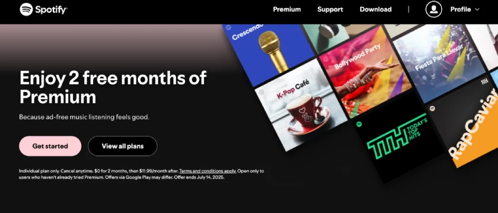
Spotify’s premium landing page is a masterclass in clarity and visual simplicity.
- Clear value proposition: "Enjoy 2 free months of Premium" is bold, immediate, and focused on the user benefit, not the product features.
- CTA optimisation: A large, visually distinct button appears right after the headline: "Get Started" & “View All Plans”—reinforcing urgency and clarity.
- Visual hierarchy: Spotify uses clean spacing, limited colours, and iconography to guide the user’s eye straight to the action.
This landing page converts exceptionally well because it simplifies decision-making while highlighting a time-sensitive offer.
2. Wix: Website Builder Mastery
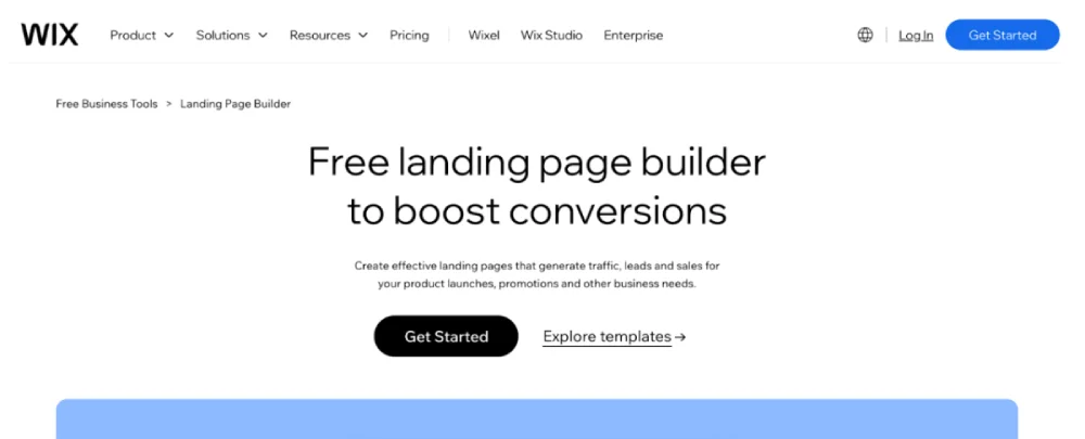
Wix’s landing pages are optimised to convert a diverse audience, from freelancers to large enterprises.
- Clean navigation structure: Full navigation menu remains accessible while maintaining focus on the core offer through strategic layout and visual hierarchy.
- Headline-subheadline combo: "Free landing page builder to boost conversions" followed by "Create effective landing pages that generate traffic, leads and sales for your product launches, promotions and other business needs."
- Dual CTA approach: "Get Started" primary button for immediate action and "Explore templates" secondary option for users who want to browse first, catering to different decision-making styles.
Wix proves that simplicity paired with visual trust is a winning formula.
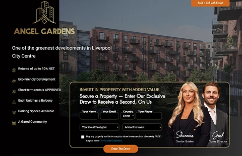
Real Estate
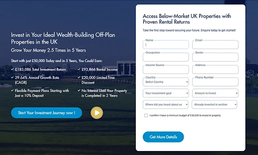
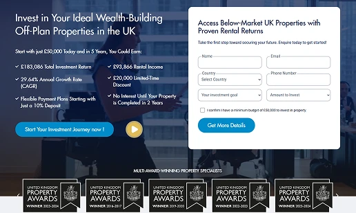
3. Opendoor: Home Selling
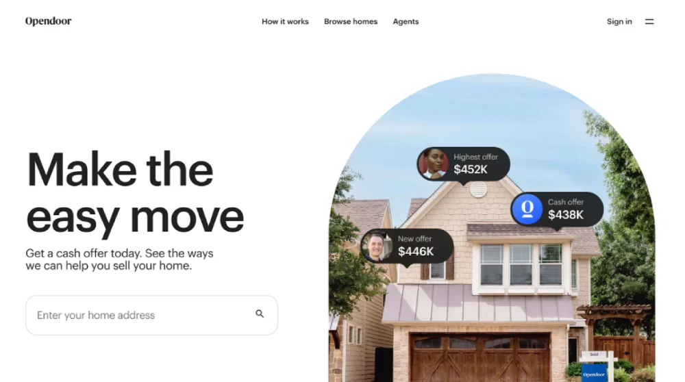
Opendoor’s landing page is built to establish instant trust—essential in a high-stakes, emotional industry.
- Visual social proof: Real offer examples displayed on the hero image showing multiple cash offers ($452K, $438K, $446K) with customer photos, demonstrating actual results and building immediate credibility.
- Emotional headline approach: "Make the easy move" focuses on reducing stress and simplifying the home selling process rather than complex features.
- Immediate action opportunity: Simple address input field allows users to get started instantly with "Get a cash offer today" messaging that creates urgency.
By combining visual proof with emotional messaging and immediate action, Opendoor effectively reduces user anxiety in a high-value transaction.
4. Redfin: Fee-Saving Focus
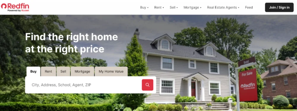
Redfin’s value proposition is centred on savings—and it communicates that with precision.
- Broad value messaging: The headline "Find the right home at the right price" focuses on value and affordability rather than explicit fee savings.
- Multi-service navigation: Clear tabs for "Buy," "Rent," "Sell," "Mortgage," and "My Home Value" provide comprehensive real estate services in one place.
- Immediate search functionality: Prominent search bar with "City, Address, School, Agent, ZIP" placeholder encourages immediate property exploration and engagement.
This approach resonates because it positions Redfin as a comprehensive real estate solution focused on finding the best value for customers.
5. HomeLight: Valuation Too
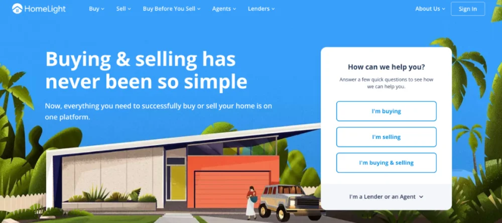
HomeLight’s landing page is focused on capturing high-intent users looking to sell.
- Simplified value proposition: The headline "Buying & selling has never been so simple" emphasises ease and convenience over speed, with supporting text about having everything on one platform.
- Intent-based user segmentation: Clear button options ("I'm buying," "I'm selling," "I'm buying & selling") with an additional dropdown for "I'm a Lender or an Agent" caters to different user types and goals.
- Question-driven engagement: "How can we help you?" approach with quick questions creates a consultative experience rather than pushing immediate valuation.
By offering personalised pathways and maintaining a consultative approach, HomeLight builds trust and captures leads more effectively.
Travel & Lifestyle
6. Airbnb: Experience Booking
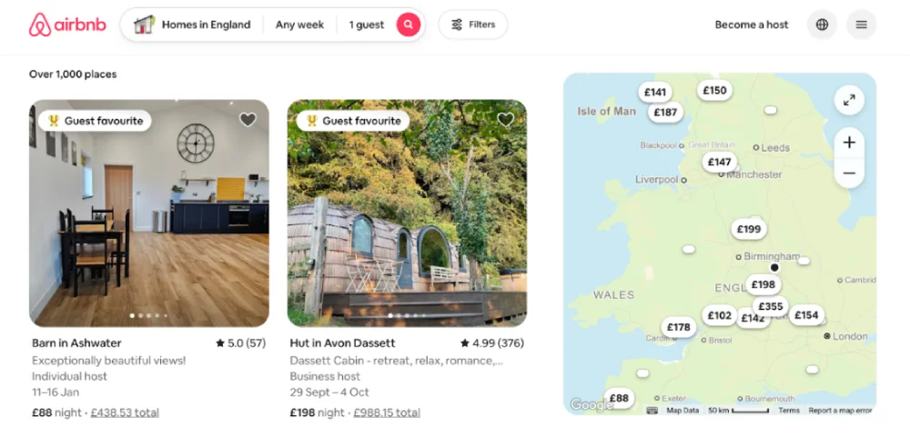
Airbnb’s landing page balances inspiration with usability.
- Localisation: The page shows listings based on the visitor’s location or browsing history, increasing relevance.
- Search optimisation: A simple, intuitive search bar is the centrepiece, aligned with user intent.
- Trust-building features: Verified reviews, host information, and secure payment icons all boost confidence.
Airbnb converts by showing value (unique, local experiences) while eliminating doubt.
Each of these examples demonstrates the principles of clarity, relevance, structure, and trust in action.
They’re not just pretty designs—they’re strategically built, tested, and optimised for user psychology and conversion performance.
Tools & Resources for Building & Testing High-Converting Landing Pages
Choosing the right tools can accelerate your landing page performance significantly. Below are the most effective and reliable tools categorised by use case—handpicked based on performance, usability, and integrations.
Landing Page Builders
Unbounce
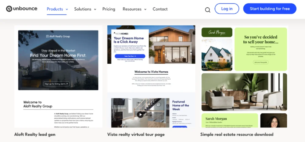
Unbounce is widely regarded as the best standalone landing page builder for serious marketers. It combines advanced A/B testing, AI copywriting support, and conversion-focused templates.
- AI-powered features: Smart Traffic automatically routes visitors to the highest-performing version of your page.
- Template library: Pre-optimised for lead generation across industries.
- Integration: Easily connects with CRMs, email platforms, and analytics tools.
Alternative Mention: Instapage — Ideal for larger teams needing collaboration and heatmaps.
Testing & Analytics Tools
Optimizely
Optimizely remains the gold standard for A/B and multivariate testing. It offers advanced experimentation features and deep analytics integration.
- Multivariate testing: Great for testing multiple variables at once.
- Statistical confidence reporting: Helps make data-driven decisions.
- Audience targeting: Personalise experiences based on user segments.
Alternative Mention: Crazy Egg — Simpler visual analytics for smaller teams (heatmaps, scroll maps).
Research & Analysis Tools
Ubersuggest
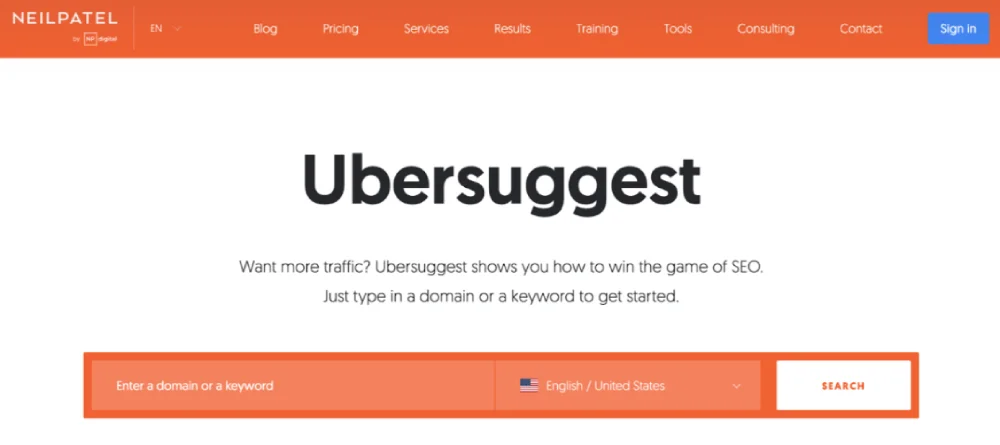
Ubersuggest by Neil Patel is a cost-effective and comprehensive SEO tool ideal for keyword and content research tailored to landing pages.
- Keyword research: Find relevant terms with high intent.
- Competitor analysis: Discover what landing pages top competitors rank for.
- Content gap discovery: Identify what your page is missing.
Alternative Mention: SEMrush — Offers a deeper suite for larger-scale competitor analysis.
Design & Development Resources
Figma
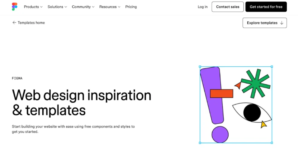
Figma is the industry leader for interface and UX design collaboration. It’s ideal for creating mobile-optimised and conversion-friendly page layouts.
- Real-time collaboration: Teams can edit and review designs live.
- Design systems: Keep your landing pages on-brand.
- Developer handoff: Export-ready CSS and design specs.
Alternative Mention: Canva — Good for quick visuals and non-designer marketing teams.
Each of these tools is designed to streamline one specific part of your landing page optimisation journey.
Start with one from each category and integrate them into your workflow to improve both speed and results.
Common Landing Page Mistakes That Kill Conversions
You can have a beautifully designed landing page, but if it’s making these mistakes, your conversions will quietly suffer.
These aren’t always obvious errors, they’re the subtle missteps that sabotage clarity, trust, and momentum. Let’s break them down.
Design Mistakes
Navigation Bars That Steal the Show


Source: flambardwilliams.co.uk
A top nav might feel “complete,” but on a landing page? It’s often just a distraction. If your goal is a lead or a sale, don’t give people an easy exit.
- Ditch the nav completely for ad-driven pages.
- If you must guide users down the page, use anchor links or a sticky CTA instead.
Too Many CTAs, Not Enough Focus
“Buy Now.” “Book a Demo.” “Read More.” It’s tempting to offer options — but more isn’t always better. Too many choices create hesitation.
- Stick to one Most-Wanted Action.
- If you need a secondary CTA, make it visually less dominant. Think of it as a plan B.
Cringe-Worthy Stock Photos
Source: superiorlawn.co.uk
People can smell fake. And nothing kills trust faster than cheesy stock photography.
- Use real photos of your team, product, or customers.
- Even better: embed user-generated content (like social media shots or video testimonials). Authenticity wins every time.
Copy Mistakes
Trying to Be Clever Instead of Clear
Clever headlines might win awards, but clarity wins conversions.
People decide in seconds whether they’ll stay — don’t make them guess.
- Use simple, everyday language.
- Cut the fluff and buzzwords. Just tell them what they’re getting and why it matters.
Talking Features Instead of Benefits
Your product might be powerful, but features alone don’t sell. People want to know what they get out of it.
- Translate features into outcomes.
- Make it about them, not you.
Example: “24/7 monitoring” → “Sleep easy knowing your site is always protected.”
Weak, Forgettable Headlines
Your headline is your make-or-break moment. If it’s vague or flat, people bounce.
- Test headlines that promise a clear result, stir emotion, or tap curiosity.
- Avoid internal language—speak how your customer thinks.
Technical Mistakes
Forgetting About Mobile
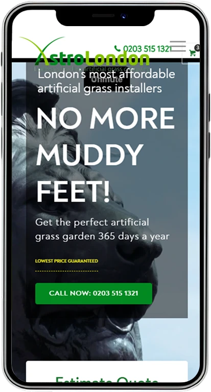
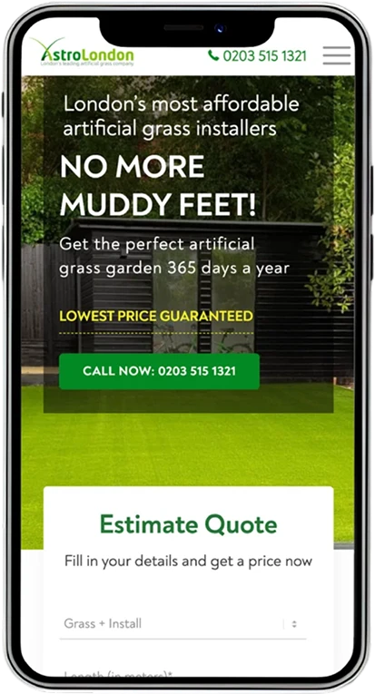
Source: astrolondon.co.uk
Over 60% of your traffic is probably coming from a phone. If your page looks clunky on mobile, that traffic is wasted.
- Design mobile-first, not just mobile-friendly.
- Keep buttons large, spaced out, and easy to tap.
- Avoid walls of text—break things up with sections and visuals.
Letting Speed Kill the Experience
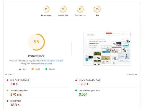
Every second your page takes to load costs you. Literally.
- Aim for a load time under 3 seconds.
- Use tools like GTmetrix or Google PageSpeed to find what’s slowing you down.
- Compress images, trim scripts, and use caching.
Form Mistakes
Asking for Too Much, Too Soon
Source: flambardwilliams.co.uk
You don’t need their full resume on the first interaction. Long forms scare people off.
- Start with just what you need (usually name and email).
- Use multi-step forms or progressive profiling to gather more later on the thank you page.
- Just cutting fields can boost conversions by over 70%.
No Trust Signals in Sight
People are wary about giving their info online — and they should be. You need to earn that trust.
- Show your SSL or secure checkout icons.
- Link clearly to your privacy policy (without sending them off-page).
- Add risk-reducers like “30-day money-back guarantee” to ease hesitation.
The difference between a decent landing page and a high-converting one often comes down to small changes. One extra field, one vague word, one slow-loading image — they all add up.
Fix these, and your page doesn’t just look better. It starts working better.
Tools & Resources for Building & Testing High-Converting Landing Pages
Landing pages are evolving, fast. With privacy rules tightening and user expectations rising, the landing pages that win in 2025 will be faster, more personalised, and deeply rooted in trust.
Here’s what the next generation of high-converting pages will look like.
AI & Personalisation
The era of one-size-fits-all landing pages is over. AI is now driving hyper-personalised experiences, adapting headlines, images, and calls to action in real-time based on who’s visiting and how they behave.
Platforms like Mutiny and Adobe Target make it easy to show different messages to different segments—automatically.
Predictive analytics takes this even further. These tools don’t just react to behaviour; they anticipate it.
AI now scores visitors based on how likely they are to convert, optimising your layout or offer before you even know there’s a problem. The result? Less guessing, more converting.
Interactive Elements
Today’s best landing pages don’t just talk at users—they interact with them. Micro-interactions like button animations, hover states, or swipe gestures create little moments of feedback that feel intuitive and satisfying.
These subtle details keep users engaged longer and signal a polished, trustworthy experience.
At the same time, progressive web apps (PWAs) are blurring the line between web and mobile apps.
With smoother transitions, faster loads, and even offline functionality, PWAs make landing pages feel more immersive—especially for mobile-first audiences.
Voice & Accessibility
As voice search becomes more common, landing pages need to shift how they communicate.
Pages optimised for conversational phrases and spoken queries will perform better on voice-driven platforms and search engines alike.
Structuring content for screen readers and voice assistants isn’t optional anymore—it’s essential.
Inclusive design is also moving from a “nice to have” to a “must have.” Accessibility isn’t just about compliance.
It’s about reaching a wider audience and building trust with every visitor, regardless of ability. Pages that follow accessibility best practices will rank higher and convert more in 2025.
Privacy & Compliance
With third-party cookies on their way out, brands must get smarter about data.
First-party data, collected directly through opt-ins, quizzes, or lead magnets, is becoming the new gold standard. But gathering it comes with a new expectation: transparency.
Compliance with GDPR and CCPA isn’t just about ticking legal boxes. The smartest brands treat it as a conversion strategy.
When visitors see clear privacy messaging, honest consent flows, and secure handling of their data, trust goes up—and so do conversions.
Final Thoughts: You’ve Got the Blueprint—Now What?
Let’s be honest—most landing pages just sit there. They look decent, maybe even win a design award, but they don’t sell. They don’t convert. They don’t build trust.
But now, you’ve got something different.
You’ve walked through the entire strategy—from understanding your audience and crafting the right message, to testing what actually works.
You’ve seen what top brands do, what to avoid, and where the real opportunities lie.
This isn’t theory. It’s the same system we’ve used to help businesses turn underperforming pages into revenue machines.
So now the question is:
Will this guide sit in your bookmarks…
Or become the turning point for how your business attracts and converts?
Because great landing pages don’t happen by accident.
They’re planned, tested, and built around what your audience actually cares about.
Need Help Implementing This?
You now have the strategies, frameworks, and examples to build high-converting landing pages. But if you need expert help with execution—we’re here.
At Credofy.com, we’ve helped businesses double their ROI by designing and optimising landing pages that actually convert.
From strategy to implementation, we bring data, design, and psychology together to turn browsers into buyers.
Frequently Asked Questions on Landing Page
What is a landing page and how does it work?
A landing page is a standalone web page designed for a single purpose: to get a visitor to take one specific action, like signing up for a newsletter or making a purchase. It works by focusing the visitor’s attention entirely on that goal, removing any distractions you’d find on a typical website.
What does a landing page do?
A landing page’s primary job is to convert visitors into leads or customers by guiding them toward one specific goal, usually tied to a marketing campaign or ad.
Are landing pages necessary for business?
Yes, they’re highly beneficial. Landing pages are essential for effective marketing campaigns, helping businesses generate leads, increase sales, and directly measure campaign performance.
Should I have a landing page or website for my business?
You should ideally have both. A website serves as your central online hub, providing general information about your business. Landing pages are specific tools used for marketing campaigns, designed to convert traffic from ads or specific promotions.
Can a landing page be a homepage?
No. While a homepage can have some conversion elements, a true landing page is distinct. It has no navigation, no distractions, and one single goal, unlike a homepage which offers broad information and navigation.
What is a landing page vs. website?
A landing page is a single, focused page for a specific marketing campaign with one goal. A website is a collection of pages providing comprehensive information and navigation for a business.
How do I set up a landing page?
You can set up a landing page using specialised landing page builders (like Unbounce), within marketing automation platforms (like HubSpot), or by coding it directly on your website.
Do landing pages rank on Google?
Yes, landing pages can rank on Google, especially if they are optimised for relevant keywords, offer valuable content, and provide a good user experience.
Do landing pages need a domain?
Yes, landing pages need a domain. They can use a subdomain of your main website (e.g., offer.yourbusiness.com) or a completely separate domain.
Do landing pages need SEO?
Yes, if you want them to be found through organic search. While many landing pages are for paid ads, optimising them with relevant keywords, good content, and fast loading speeds can help them rank organically and improve ad Quality Score.
How does a landing page look like?
A landing page is typically clean and uncluttered. It features a compelling headline, a clear value proposition, engaging visuals (image/video), benefit-oriented copy, social proof (testimonials/trust badges), and a prominent, singular Call-to-Action (CTA) form or button. It usually lacks a navigation menu.
How much do landing pages cost?
The cost varies widely:
- Free: Some website builders or marketing platforms offer basic landing page features within their free plans.
- DIY Builders: ~$25-$300 per month for dedicated landing page software (e.g., Unbounce, Instapage).
- Custom Designed: $500 – $5,000+ per page if you hire a freelancer or agency, depending on complexity and features.
What is the ideal conversion rate for a landing page in 2025?
While the average conversion rate for landing pages is typically around 6-7%, top-performing pages can achieve 11% or more, with elite examples reaching 20-30%. The “ideal” rate depends heavily on your industry, target audience, and the complexity of your offer. For example, e-commerce might average 1.6-2.5%, while SaaS pages often aim for 3-5%.
How does Alex Hormozi's Value Equation apply to landing pages?
Hormozi’s Value Equation (Value = (Dream Outcome * Perceived Likelihood of Achievement) / (Time Delay * Effort & Sacrifice)) teaches that a high-converting landing page should:
- Maximise: The perceived Dream Outcome (what the user truly wants) and the Perceived Likelihood of Achievement (how confident they are they’ll get it).
- Minimise: The Time Delay to achieve the result and the Effort & Sacrifice required from the user. By addressing these four levers, you make your offer more irresistible on the landing page.


