Your CTAs Are Broken? Here’s What Works Now


Your CTAs Are Broken? Here’s What Works Now
Table of Contents
Serious about growing your business? Let’s plan exactly how to get you more leads, sales, and results—faster.
After analysing countless articles and videos, I noticed something really interesting.
Everyone talks about how important CTAs are. But hardly anyone shows you:
Why does it actually matter?
And which common CTA mistakes are silently killing your conversions?
Here’s the truth:
99% of your CTAs fail because they’re forgettable, vague, or just plain salesy.
And in a world where attention spans are short and buyers are sharper than ever, your CTA doesn’t get a second chance.
One weak CTA… and you’ve lost the click, the lead, and the sale.
So in this guide, I’m going to cut through the fluff and discuss-
- Key CTA statistics you need to know
- Best practices for high-converting CTA design
- Tools to A/B test your CTAs
- Mistakes to avoid at all costs
Let’s dive in.
What Actually is a Call to Action (CTA)?
A Call to Action is a prompt — usually a word, phrase, or button — that tells your audience exactly what to do next.
Well…I know you all know this simple definition.
So, what’s new to uncover here?
Actually, here is what you need to know: a great CTA does more than just instruct. It guides, persuades, and converts.
They are an unspoken contract between you and your users. So, you need to be very particular about what is your CTA, where it is leading your users, and how fast they are getting what has been promised.
CTAs can actually appear as buttons, links, banners, forms, or even spoken commands in voice interfaces. You’ve seen them a thousand times:
- "Start your free trial."
- "Join our newsletter"
- "Add to cart"
- "Watch the demo."
The goal?
To reduce friction and create a clear, compelling path forward.
Marketing Research & Strategy
We help you understand your market and build smart strategies to attract more customers and grow faster.
- Detailed research into your competitors, customers, and market
- Custom marketing and growth plans that drive real results
- Clear action steps to increase traffic, leads, and sales

ADWORDS ROI

Cut Ad spend
Key CTA Statistics That You Need to Know:
- Clear and action-driven CTAs can boost conversions by up to 161%.
- Positioning your CTA at the bottom of product pages has been shown to increase conversions by 70%.
- Tailored, personalised CTAs outperform generic ones by 202%.
- Simply enlarging the CTA button can result in a 90% increase in click-through rates.
- CTAs optimised for mobile responsiveness see a 32.5% boost in conversions.
- Adding time-sensitive language (e.g., “Limited Offer”) can spike conversion rates by as much as 332%.
- Changing the CTA button colour—even subtly—can lead to a 21% increase in conversions.
- CTAs placed above the fold generate 304% more clicks than those placed further down the page.
- Internal CTAs (within the content) outperform sidebar CTAs with a 121% higher click-through rate.
- Centre-aligned CTAs tend to dominate attention, receiving 682% more clicks than those aligned to the left.
- Reducing clutter by featuring only one primary CTA per page can increase conversions by 266%, as multiple CTAs often distract or overwhelm users.
Stats Source: 7 Best Types of CTAs To Boost Your Conversions
So….Why CTAs Matter Now More Than Ever?
Attention is currency — and it’s really expensive.
We live in a world shaped by AI-generated content, hyper-personalisation, and constant digital noise. That means your CTA isn’t just a design element anymore — it’s actually a critical conversion asset.
Here’s why CTAs are more essential (and more strategic) than ever:
1. Shorter Attention Spans, Higher Stakes
You have seconds — sometimes less — to capture interest. A vague or passive CTA won’t cut it. People need clarity, and they need it fast.
2. AI-Driven Content Demands Human Intuition
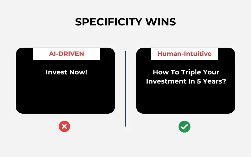
AI tools can generate copy, but they can’t always understand what actually motivates action. A CTA needs to be rooted in real human psychology — urgency, curiosity, value, and trust.
3. Personalisation Is No Longer Optional
Thanks to behavioural data and AI segmentation, audiences now expect relevant, personalised prompts. A one-size-fits-all CTA is invisible, but tailored CTAs are magnetic.

Source: Wisernotify
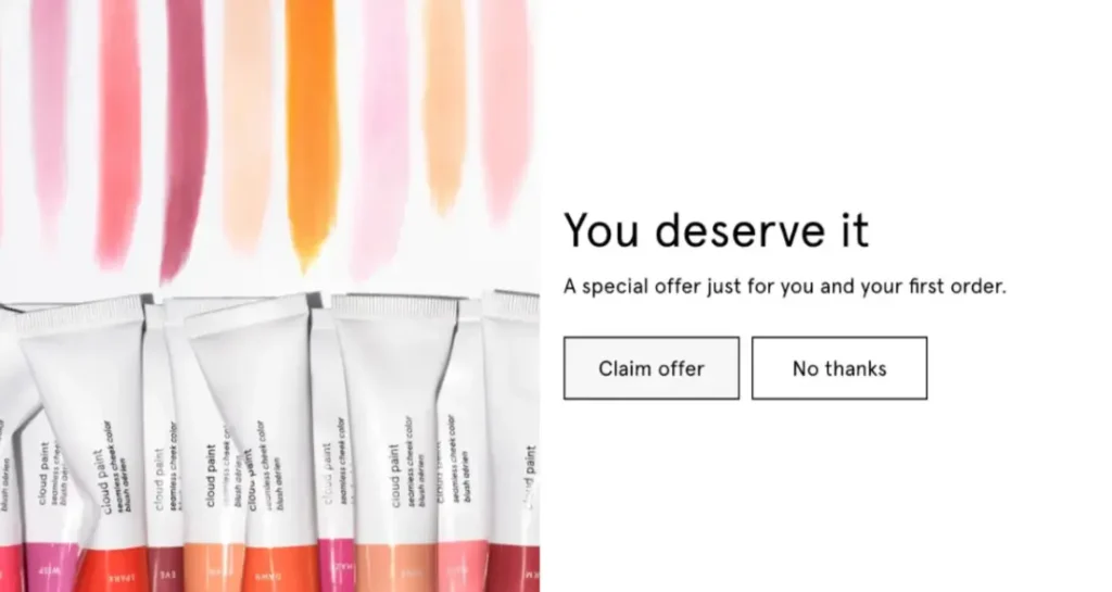
Source: Glossier
Moreover, personalised CTAs always convert better, take a example of Glossier offering a first-time discount just for you, or Wisernotify showing real-time activity to build trust and urgency.
4. Multi-Device, Multi-Channel Experiences
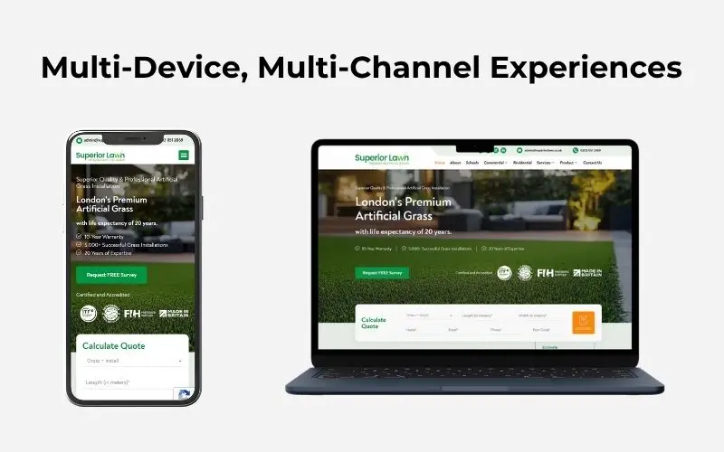
Your CTA might be tapped on a phone, spoken to a voice assistant, or seen in an email preview. That means it must be clear, adaptable, and instantly recognisable across formats.
In short, CTAs aren’t optional add-ons. They’re strategic levers. And if you want people to take action, you really need to master how — and where — to pull them.
Read More: 33 High-Converting Call-to-Action Examples (Latest Edition)
Digital Marketing, SEO & PPC
- SEO to boost rankings and capture high-intent, AI-driven traffic
- Performance Marketing to run ROI-focused campaigns that convert
- Content Marketing to drive clicks, earn links, and build authority

What are the best CTA Design Practices?
Here are the proven design principles behind high-converting CTAs:
1. Contrasting Colors
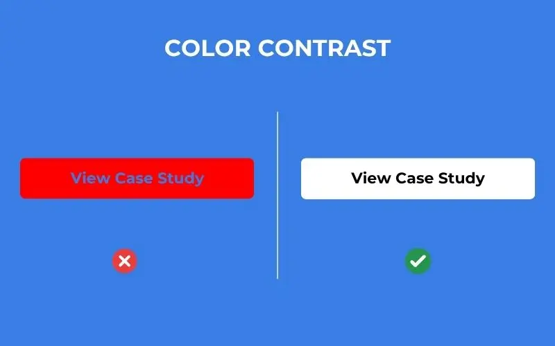
Your CTA button needs to stand out from the rest of your content.
Using high-contrast colors for your CTA against a more muted or neutral background makes it immediately noticeable.
For instance, if your brand colors are predominantly blue, a white or yellow CTA button will create enough visual “friction” to grab attention without clashing with your overall design.
2. Optimal Size
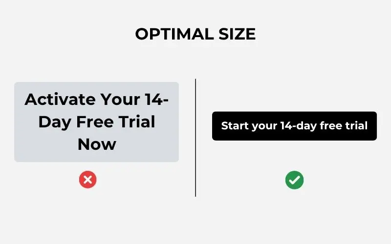
The size of your CTA button is important for both visibility and usability.
It should be large enough to be easily seen and tapable on mobile devices, but not so large that it overwhelms the surrounding content or appears aggressive.
The goal is to make it easy to interact with without being visually jarring.
3. Clear Typography
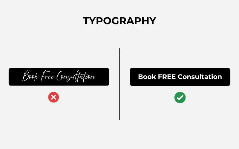
The text on your CTA must be instantly readable.
This means using clean, legible fonts and ensuring there’s a high contrast between the text and the button’s background color.
Avoid using jargon or overly complex language; the message should be straightforward and clear at a glance.
4. Negative Space
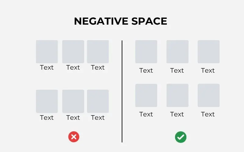
Negative space, also known as whitespace, refers to the empty area around your CTA button.
Giving your CTA ample negative space helps it stand out and prevents it from looking cluttered.
This visual breathing room draws the user’s eye directly to the button, increasing its prominence and encouraging clicks.
5. Emoji Use
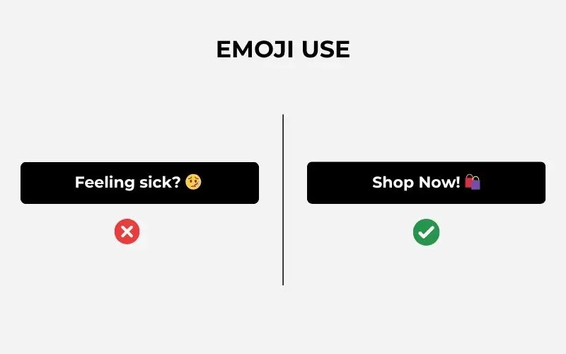
Emojis can add a touch of personality and emotional tone to your CTAs, especially in the right context.
For example, a “Find the Perfect Gift 🎁” CTA uses an emoji to instantly convey the nature of the offer.
When to use emojis:
- In social media ads and mobile-first CTAs.
- For lifestyle, direct-to-consumer (DTC), or Gen Z-focused brands.
When to avoid emojis:
- In formal enterprise settings or for legal and medical CTAs, where a serious tone is required.
6. Consistent Styling
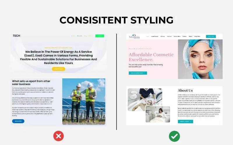
All your CTAs should maintain a consistent look and feel across your website and other platforms.
This includes the button shape, color scheme, hover effects, and overall design. Consistency builds brand trust and helps users recognize actionable elements quickly.
If your “Book Now” button looks completely different on one page than another, it can confuse or even deter users.
A cohesive visual identity reinforces the user’s journey and creates a smoother, more intuitive experience, which ultimately boosts conversions.
Are there any tools for CTA A/B Testing?
Ofcourse yes!
Various tools help you in A/B testing your CTAs.
So, if you’re not testing, that means you’re just guessing. Use these tools to split-test variations and make data-backed decisions:

Known for real-time personalisation and machine learning. Great for optimising CTAs based on user behavior.
Combines A/B testing with personalisation. Includes a visual editor and detailed reports for both marketers and developers.
Offers predictive targeting and adaptive testing. Ideal for advanced A/B and multivariate CTA testing.
All-in-one platform with A/B testing and AI-powered personalisation. Helps recommend the best CTAs automatically.
Free AI-based A/B testing tool for landing pages. Focuses on CTA optimisation and works with Google Analytics 4.

Full-featured testing tool with heatmaps, session recordings, and user segmentation to analyse CTA performance.

Part of Adobe Marketing Cloud. Supports strong A/B testing and personalisation for websites and apps, including CTAs.
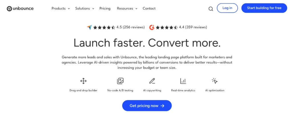
A landing page builder with built-in A/B testing to easily test different CTA variations.
What CTA Mistakes Are Killing Your Conversions?
Avoiding these pitfalls will instantly make your CTAs more persuasive, engaging, and trustworthy.
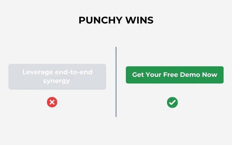
1. Vague Wording
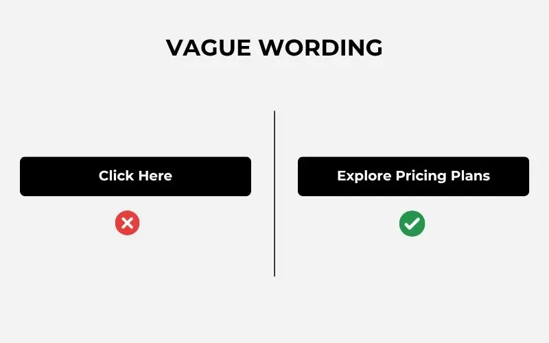
Phrases like “Click Here,” “Submit,” or “Go” lack clarity and intent. Your CTA should tell users exactly what they’re getting and why it matters.
2. Too Many CTAs on One Page
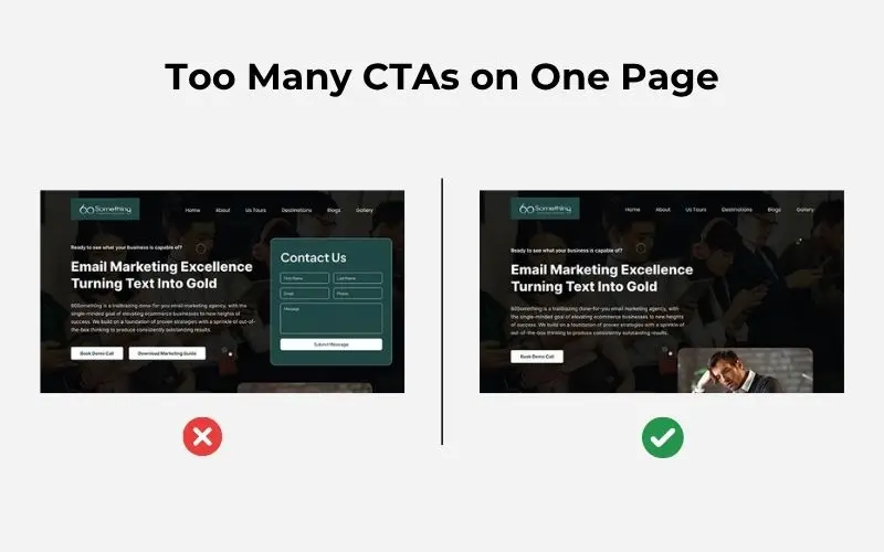
When everything is the most important thing, nothing is. Choose a primary CTA and, at most, one secondary action (like “Learn More”).
3. Low Contrast
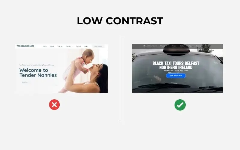
If your CTA blends in with your background or page design, it won’t get noticed — or clicked. Always check contrast ratios for accessibility and visibility.
4. Hidden CTAs
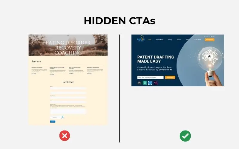
Some designers hide CTAs below the fold, behind confusing menus, or in hover states. Don’t make people hunt — be obvious.
5. Breaking the CTA Promise
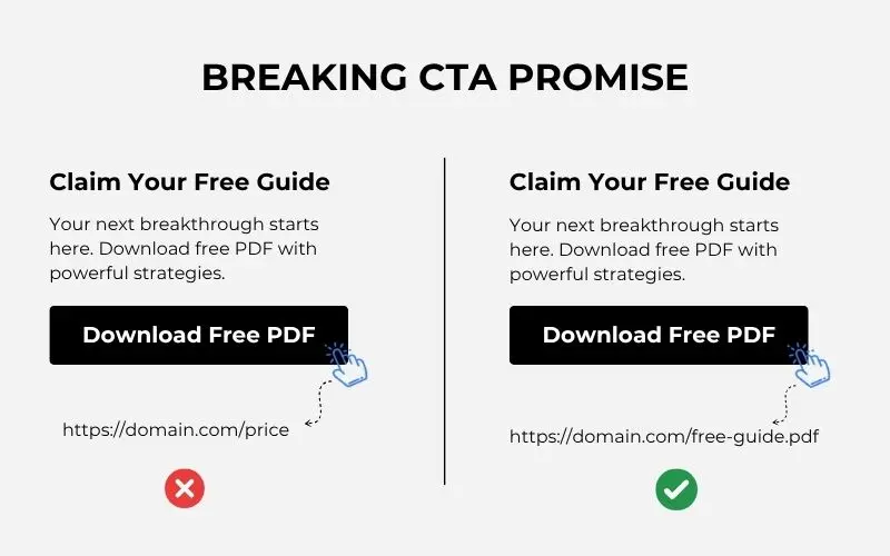
If your CTA says “Free Guide,” but takes users to a gated form with zero context, you’ve just damaged trust. Deliver exactly what you promise — and fast.
6. No Mobile Optimisation
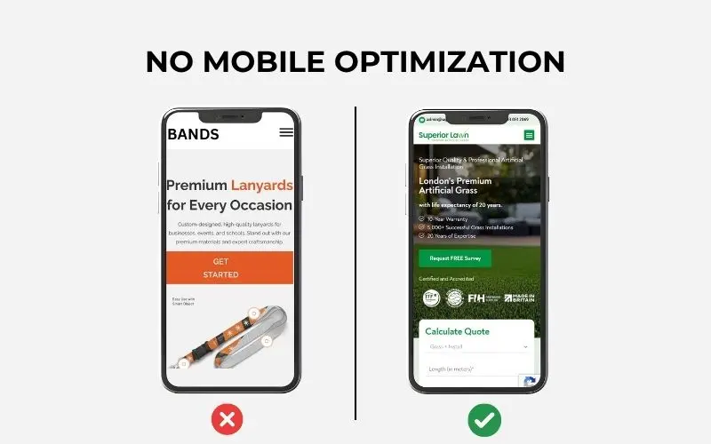
Tiny buttons, slow load times, or CTAs that don’t work on mobile? You’ll lose the majority of your audience. According to the latest trends, all CTAs must be designed to be mobile-friendly.
TL;DR
In this guide, we broke down:
- What a CTA really is and why it matters more than ever
- Key CTA statistics that prove how design and placement dramatically impact performance
- Best practices to create CTAs that are clear, compelling, and action-driving
- Tools to A/B test and optimise your CTAs with data
- And the most common CTA mistakes you must avoid to stop bleeding conversions
In a world of short attention spans and sharp competition, your CTA has one shot to make someone act.
No clarity? No clicks.
No emotion? No engagement.
No testing? No improvement.
But with the right strategies, even small tweaks to your CTA can lead to massive gains.
So now, it’s your move.
Audit your current CTAs. Test new variations. Keep refining.
Because in the end, a single button can decide your next sale.
Struggling with low conversions?
Sometimes it’s not your offer, it’s your CTA doing all the damage.
Book a Free Discovery Session and let’s uncover exactly what’s holding back your leads from turning into your clients.
Frequently Asked Questions (FAQs)
What is the best CTA colour for conversions?
There’s no universal “best” colour, but the key is high contrast with your background. For example, if your site is mostly blue, try a yellow, white, or orange CTA. What matters more than the colour itself is how much it stands out visually and fits your brand.
How many CTAs should I place on a landing page?
Ideally, one primary CTA. You can have a secondary action (like “Learn More”), but anything beyond that risks overwhelming users. Stick to one goal per page to keep conversions clean and focused.
What tools can I use to A/B test my CTAs?
You already explored a few in the blog, but here’s a recap:
- Optimizely for behavioural-based testing
- VWO for heatmaps and user segments
- Unbounce for CTA-focused landing pages
- Fibr AI for free AI-powered CTA tests
Dynamic Yield and Kameleoon for advanced personalisation
All of these help test button size, colour, placement, and wording.
Are emojis in CTAs actually effective?
Yes — when used intentionally. Emojis can boost clicks in social ads, emails, or DTC landing pages. But avoid them in serious, professional, or regulated industries. Think about your brand tone and your audience.
Should I place my CTA above or below the fold?
Both, strategically. CTAs above the fold get 304% more clicks, but CTAs near product descriptions or after scroll depth often convert better. Test placements and combine internal CTAs with main ones for best results.
How often should I update or test my CTAs?
If you’re not A/B testing monthly, you’re leaving money on the table. Regular testing of CTA text, colour, and position can show surprising results. Even small changes like word choice (“Try” vs. “Get”) can lead to major conversion lifts.


