7 Best Types of CTAs To Boost Your Conversions


7 Best Types of CTAs To Boost Your Conversions
Table of Contents
Serious about growing your business? Let’s plan exactly how to get you more leads, sales, and results—faster.
You’re getting traffic. People are clicking. But conversions? Still flat.
It’s frustrating, right?
You’ve done the hard work, written the content, built the pages, maybe even paid for ads. But somewhere between interest and action, you’re just slipping away.
And in most cases, the silent culprit is that your Call to Action just isn’t doing its job.
Maybe it’s too vague.
Maybe it’s too pushy.
Or maybe it shows up at the wrong time, like a waiter asking if you want dessert before you’ve even seen the menu.
Here’s the truth:
What works on a product page won’t work in a blog. A newsletter CTA shouldn’t feel the same as a landing page button. Context is everything, and your CTA has to match the mindset your user is in.
That’s why in this guide, we’re breaking down the 7 essential types of CTAs every business needs to know,
Not just what they look like, but why they work, and when to use them.
Because when your CTA meets your user at the right moment, in the right way?
That’s when clicks turn into conversions — and browsers turn into buyers.
Let’s fix that final step in your funnel — once and for all.
Marketing Research & Strategy
We help you understand your market and build smart strategies to attract more customers and grow faster.
- Detailed research into your competitors, customers, and market
- Custom marketing and growth plans that drive real results
- Clear action steps to increase traffic, leads, and sales

ADWORDS ROI

Cut Ad spend
Key CTA Statistics That You Need to Know:
Before starting this article, let’s uncover some key stats you should know about CTAs.
- Clear and action-driven CTAs can boost conversions by up to 161%.
- Positioning your CTA at the bottom of product pages has been shown to increase conversions by 70%.
- Tailored, personalised CTAs outperform generic ones by 202%.
- Simply enlarging the CTA button can result in a 90% increase in click-through rates.
- CTAs optimised for mobile responsiveness see a 32.5% boost in conversions.
- Adding time-sensitive language (e.g., “Limited Offer”) can spike conversion rates by as much as 332%.
- Changing the CTA button colour—even subtly—can lead to a 21% increase in conversions.
- CTAs placed above the fold generate 304% more clicks than those placed further down the page.
- Internal CTAs (within the content) outperform sidebar CTAs with a 121% higher click-through rate.
- Centre-aligned CTAs tend to dominate attention, receiving 682% more clicks than those aligned to the left.
- Reducing clutter by featuring only one primary CTA per page can increase conversions by 266%, as multiple CTAs often distract or overwhelm users.
Types of CTAs
Not all Calls to Action are created equal, and not all should be. Different user journeys demand different types of prompts.
Below are the core CTA formats every modern marketer and business owner should know, along with when (and why) to actually use them.
1. Buttons
The most common — and still the most effective — CTA format. A well-designed button stands out visually, feels clickable, and gives you a clear instruction.
Best for: Websites, landing pages, eCommerce, email footers
Examples:
- "Add to Cart"
- "Get Started"
- "Try It Free"
- “Read More”
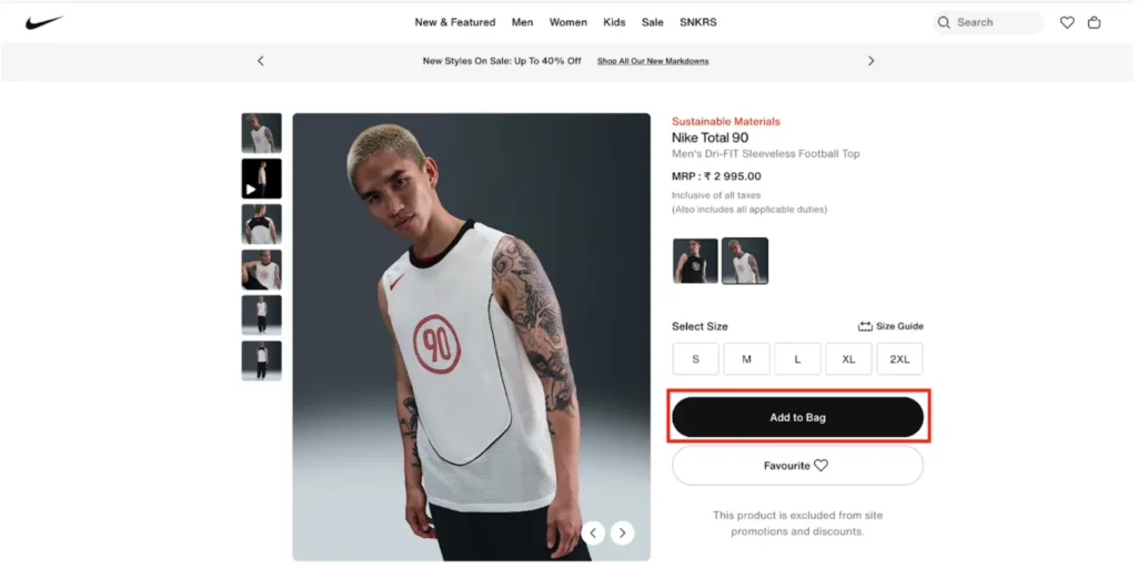
Image Source: Nike
As shown in the image above, this is a classic button CTA — “Add to Bag” — designed to stand out and drive immediate action.
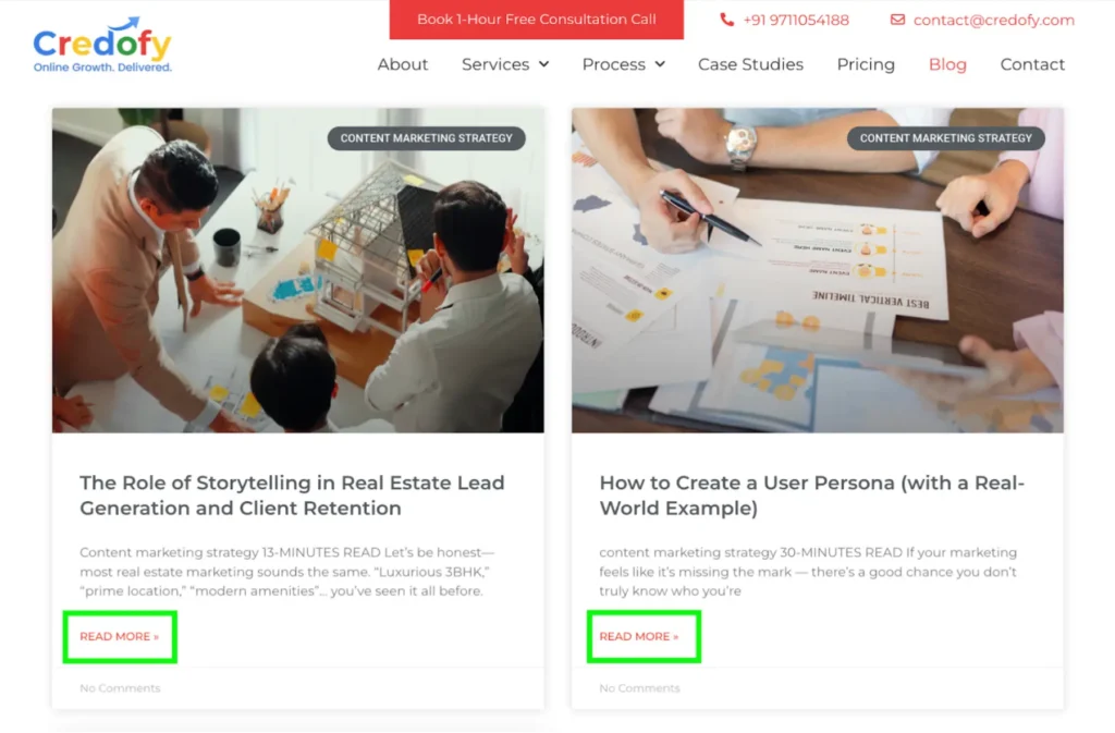
Image Source: Credofy Solutions
Here’s an example of a “read more” button CTA. This builds instant clarity and is action-driven.
- Instant clarity: Buttons use direct action words like “Buy” or “Start,” so users know exactly what to do.
- Visually obvious: A good button stands out on the page with color, size, and design, making it hard to miss.
- Familiar behavior: People are used to clicking buttons online. It feels natural, which reduces hesitation.
- Fast interaction: With one click, users can take action — no thinking or searching required.
- Mobile-friendly: Buttons work well across devices and are easy to tap on phones and tablets.

Pro Tip
Use contrasting colors and short, verb-led copy to make buttons pop without overwhelming the page.
Digital Marketing, SEO & PPC
- SEO to boost rankings and capture high-intent, AI-driven traffic
- Performance Marketing to run ROI-focused campaigns that convert
- Content Marketing to drive clicks, earn links, and build authority

2. Welcome Gates
A welcome gate is a full-screen CTA that appears when you first land on a site, often offering a lead magnet in exchange for your email.
Best for: Email list building, free downloads, special offers
Examples:
- "Unlock the Free Guide"
- "Get Instant Access"
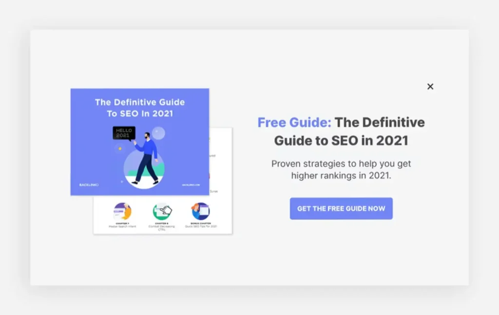
Image Source: Wix
As shown in the image above, this is a welcome gate — a full-screen CTA with a “Get the free guide now” button that appears as soon as a user lands on the website.
- Grabs full attention: It takes over the screen, so there are no distractions — just one clear message.
- Front-loads value: Users are immediately shown an offer (like a free guide), making them more likely to engage.
- Creates urgency: The limited-time or exclusive feel often encourages quick action.
- Boosts list building: Perfect for collecting emails right away — before the user gets distracted.
- Qualifies interest early: If someone engages with the gate, they’re already showing intent.
Pro Tip
Keep the copy value-focused and friction-free. You've got about 3 seconds to earn that opt-in.
3. Forms
Forms combine your CTA with a data capture opportunity. Whether it’s a quote request or a webinar sign-up, the CTA actually lives within the form button itself.
Best for: Lead gen, booking demos, collecting feedback
Examples:
- "Get A Free Quote"
- "Reserve Your Spot"
- “Contact Us”
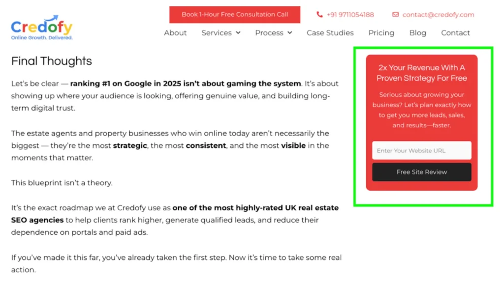
Image Source: Credofy Solutions
As seen in the image above, this is a form-based CTA, where the call to action is embedded directly within the form’s submit button (“Free Site Review”).
Forms like these combine the CTA with a chance to capture user data, making them a powerful tool for conversion.
- Action + information in one step: Users take action and share their details at the same time, streamlining the conversion.
- Shows strong intent: Filling out a form is a higher-commitment action, so it often signals a serious lead.
- Highly customizable: You can tailor the form fields and CTA button to match your goal, whether it’s booking a call or getting feedback.
- Triggers next steps: Once submitted, forms often kick off automated emails, demos, or onboarding flows, keeping momentum going.
- Great for lead nurturing: Capturing contact details allows you to follow up and build a relationship.
Pro Tip
Minimise the number of fields. The fewer barriers between you and the action, the better your conversion rate will be.
Marketing Research & Strategy
We help you understand your market and build smart strategies to attract more customers and grow faster.
- Detailed research into your competitors, customers, and market
- Custom marketing and growth plans that drive real results
- Clear action steps to increase traffic, leads, and sales
ADWORDS ROI
Cut Ad spend
4. Banners
Banner CTAs stretch across a section of the page — either as a top bar, mid-content promo, or sticky footer. They’re subtle but strategic.
Best for: Announcements, limited-time offers, site-wide promos
Examples:
- “Final Hours: 25% Off Everything"
- "See What's New"
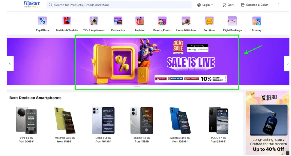
Image Source: Flipkart
The above image of the “Sale is Live” is also a great example of Banner CTA.
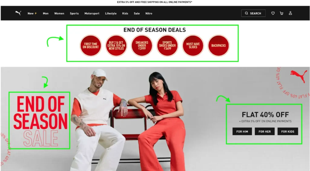
Image Source: Puma
In the banner of this Puma landing page, there are multiple CTAs. These all get instant attention and are quite effective.
- Always visible: Whether fixed to the top, middle, or bottom, banners stay in sight without interrupting the experience.
- Low friction: They don’t block content, so users can keep browsing while still seeing the offer.
- Perfect for promotions: Banners are great for time-sensitive deals, product drops, or important announcements.
- Drives action passively: Subtle placement means users are nudged without feeling pressured.
- Works site-wide: You can display banners across all pages, boosting visibility and clicks.
Pro Tip
Banners work best with urgency or exclusivity — think countdowns, flash sales, or product drops.
5. Contextual Links
These are inline CTAs embedded within the text of a blog post, email, or product description. Less flashy, but often more natural.
Best for: Content marketing, SEO pages, email copy
Examples:
- "Download the free checklist here."
- "See the full guide.”
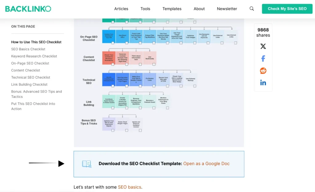
Image Source: Backlinko
As shown in the image above, this is an example of an inline free checklist CTA—embedded naturally within the content of a blog post. It doesn’t interrupt the reading experience but still stands out enough to guide users toward a valuable action.
- Feels natural: They blend smoothly into the content, making the CTA feel like a helpful suggestion, not a sales pitch.
- Improves flow: Readers don’t have to stop or shift focus — they can click when it feels relevant to them.
- Boosts engagement: Well-placed links increase time on site by guiding users to explore more content.
- Supports SEO goals: Internal links help search engines crawl your site and improve content structure.
Pro Tip
Don't overdo it. One well-placed link CTA can actually outperform three scattered, vague ones.
6. Pop-Ups
Love them or hate them, pop-ups still convert when you use them correctly.
Triggered by user behaviour (like scroll depth or exit intent), pop-ups can present just the right message at just the right time.
Best for: Lead capture, exit offers, coupon codes
Examples:
- "Wait! Get 10% Off Before You Go"
- "Subscribe for Weekly Tips"
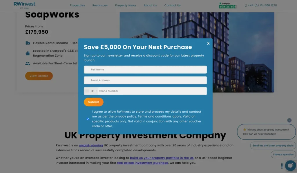
Image Source: RW invest
As shown in the image above, a pop-up CTA appears automatically when a user visits the website, instantly capturing their attention.
- Targets user behavior: Pop-ups appear based on actions like scrolling or exit intent, catching users at key decision moments.
- Delivers timely offers: They present the right message (discounts, sign-ups, reminders) exactly when users are most likely to respond.
- Grabs instant attention: Pop-ups stand out visually, making them hard to ignore.
Pro Tip
Make them easy to close. A pushy pop-up creates friction, but a well-timed one creates opportunity.
7. Social Sharing
Social sharing CTAs ask users to share your content with others. They’re one of the easiest and least pushy ways to get people to engage with your brand.
You’ll often see these as small icons or buttons on blog posts, landing pages, or product content. When placed effectively, they can help your content reach a wider audience with minimal effort.
But don’t just add them everywhere. Avoid placing them on pages where users are entering sensitive information, like checkout or sign-up forms.
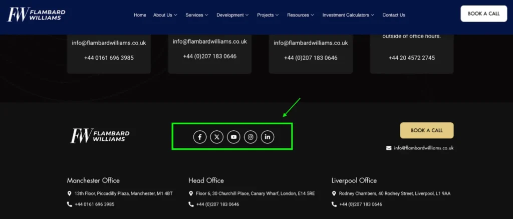
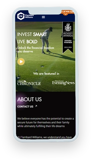
Image Source: Flambard Williams
As shown in the image, we added their social media handle links to the Contact Us page specifically.
- Low effort, high impact: It takes just one click for users to spread your content to their network.
- Expands your reach: Shared content can attract new visitors without you spending extra on ads.
- Builds trust through peers: People are more likely to engage with content recommended by friends or colleagues.
- Boosts content visibility: Great for blog posts, guides, and launches — especially when timing and messaging align.
- Encourages organic growth: Helps grow your brand naturally through word-of-mouth and community exposure.
Pro Tip
Customize the sharing buttons to match your brand and make sure they’re only on pages where it makes sense.
Struggling with low conversions?
Sometimes it’s not your offer, it’s your CTA doing all the damage.
Book a Free Discovery Session and let’s uncover exactly what’s holding back your leads from turning into your clients.
Best Call-to-Action Examples
Just knowing the theory isn’t enough—you need to see how it works in the real world. Because when done right, clear and action-driven CTAs can boost conversions by up to 161%.
So, let’s break down 33 high-converting Call-to-Action examples that actually get results.
- Schedule Your [x] Session/ Talk to an Expert
- Unlock Your Bonus
- Calculate Your [Potential]
- Access the Insider Playbook
- Design Your [Roadmap]
- See How It Works
- Add to Bag
- Only X Left in Stock
- Reveal Today’s Deal
- Limited Restock: Shop Now
- Upgrade & Save X%
- Get Code
- New Arrivals
- Join 18,000+ [Niche-people] Using [Tool]
- Don’t Miss Out — Tap Now / Claim the Offer Before It Ends
- Grab the Offer Bundle
- Let’s Build It Together
- Get Early Beta Access
- Get Pricing Now
- Access the Resource Library
- Download the Full Report
- Join the VIP List
- Watch the Demo
- Join the Workshop
- Get Instant Access
- Subscribe for Weekly Insights
- Install Now
- RSVP For [Date]
- Take the [xx] Sec Quiz
- “Find out more”
- Follow Your [x] Journey
- Get Free [x] / Claim Your Free [x]
- Choose the Right Plan
So…..Let’s Wrap Up!
Actually, your CTA isn’t just a button or a phrase. It’s the final handshake in your user journey — the turning point where curiosity becomes commitment.
So far, we’ve unpacked two critical truths:
The core frustration shared by 99% of business owners: you’re getting leads, but not turning them into clients.
The 7 essential types of CTAs — complete with real-world examples and the psychology behind why they work so well.
Remember,
A high-performing CTA isn’t about being clever, loud, or flashy. It’s about meeting your user exactly where they are, with the right message at the right moment. Because when your CTA aligns with their mindset, it no longer feels like a push — it feels like the obvious next step.
If you’ve been losing leads at the last mile, this is your fix.
Stop treating CTAs like a design afterthought. Start treating them like the strategic, revenue-driving assets they are — and watch what happens when clarity meets context.
That’s how browsers turn into buyers.


